

Microscope Brand Guideline Program
The Microscope brand is a living, breathing entity, designed for flexibility and growth. This program will assist with consistent application to promote the work of Microscope as a professional organization.
The guidelines set forth in this document are intended for the initial launch of Microscope and the initial 24 months. After a period of two years, the recommendations presented here should be reviewed and revised as required to respond to communication needs, adaptation to technology and company growth.
PLEASE NOTE: This online document is intended as a quick reference only. Please review the complete brand guidelines to see all program specifications and suggestions.
Microscope Repsonsive Logo System
The first element of the Responsive Logo System is the primary lockup—below left. The Microscope lockup is composed of 2 primary elements. 1. The Microscope symbol and 2. The Microscope word mark. The symbol is inspired by the lenses found on a compound microscope which is used as a metaphor for the work that Microscope performs for its’ clients. This suggests the process-oriented, repeatable approach to engaging clients. When ever possible, this lockup is the preferred way to present the Microscope brand identity.
To ensure the Microscope lockup and logo are consistent, maintain optimal legibility and prominence, an area of clear space has been defined. This clear space should be maintained around the logo in all applications. The distance should, ideally, be equal to or greater than the X indicator. For Microscope, the X indicator is the dimension of the height of the letterrin the lockup. This space is indicated by “X” in the diagrams below right.


Microscope Responsive Logo Assets
Most logos become illegible when rendered at small sizes or in challenging applications such as via facscimilie, embroidery or promotional items. The Microscope responsive logo is designed to maintain integrity, clarity, legibility and presentation regardless of size required. The primary lockup is the first point of the responsive logo system and should be used whenever possible down to a minimum size of 1” wide or 72px. Smallest use case reference point can be seen on business card layout.


FILE FORMAT NOTES
PDF Files are Vector PDF suitable for print production or promotional items. SVG Filesmay be used in Microsoft Office Applications. PNG Files are suitable for Microsoft Office Applications. Depending on browser configuration, users may need to right click and choose "save link as" to download to their local workstation.
Typography
IBM Plex Sans
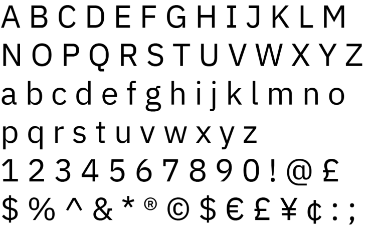
The primary type face for the Microscope Brand Identity System is Plex Sans. This face is strong, confident and clear.
IBM Plex™ is an international, open source typeface family designed by Mike Abbink, IBM BX&D, in collaboration with Bold Monday, an independent Dutch type foundry. Plex was designed to capture and illustrate the unique relationship between mankind and screen—a critical observation for our modern times. The result is a neutral, yet friendly Grotesque style typeface that emphasizes legibility in print, web and mobile interfaces. The unexpectedly expressive nature of the italics gives even more options for communications.
For the Microscope brand program, we are specifying the TrueType versions of IBM Plex Sans in Regular and SemiBold as released by Google Fonts. Plex Sans is an free, open source font, therefore there is no requirement for workstation licensing fees. At time of publication of this guide, we are using IBM Plex v 4.0.2.
Color Values and Application
Beyond the Microscope logo, color is the most recognizable aspect of the brand identity. Microscope brand colors reflect a bold, confident approach. Using color appropriately is one of the easiest ways to make sure the materials maintain a cohesive Microscope brand. The top 3 colors come directly from the tri-colors of the Microscope logo and should be reserved for use accent colors or large type statements such as headlines, as seen in the Microscope overview brochure. The remaining colors, Just Black and the two gray tones should be used for text and diagrams. Body copy in the brochure and website is specified in Microscope Medium Gray.

MICROSCOPE BLUE
CMYK 77 31 15 0
HEX #2D7EAC
R45 G126 B172

MICROSCOPE GREEN
CMYK 75 0 100 0
HEX #3BA933
R59 G169 B51

MICROSCOPE YELLOW
CMYK 0 28 100 0
HEX #FAAE00
R250 G174 B0

MICROSCOPE LIGHT GRAY
CMYK 0 0 0 30
HEX #999999
R153 G153 B153

MICROSCOPE MEDIUM GRAY
CMYK 59 51 50 19
HEX #555555
R85 G85 B85

JUST BLACK
CMYK 0 0 0 100
HEX #00000
R0 G0 B0
Microscope Repsonsive Quickguide™
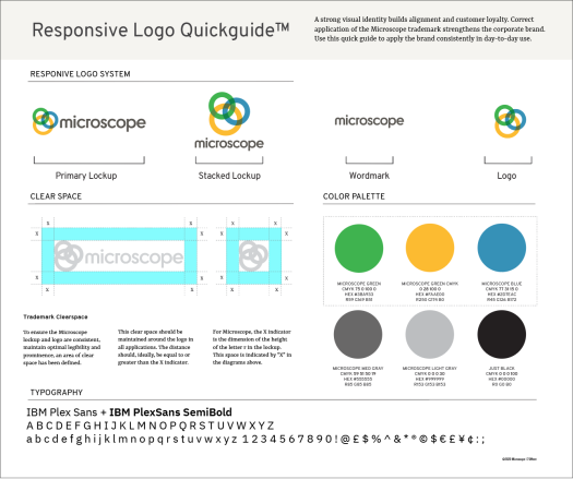
A strong visual identity builds alignment and customer loyalty. Correct application of the Microscope trademark strengthens the corporate brand.
The Microscope Responsive Logo Quickguide™ includes the core elements of the brand indentity program, common useage considerations and color specifications. This one-page view is a useful reference for introducing people to brand fundamentals and as a fact-checking tool. Use this quick guide to apply the brand consistently in day-to-day use.